Visual Designer
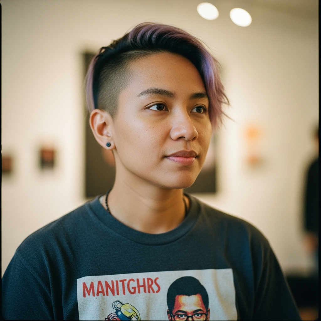
Kai
Visual storytelling. Color theory. The cold blue of the reveal. The warm orange of Jan.
"Orange feels safe. That's why Jan is orange. Until he isn't."
Color as emotional manipulation
About
Every color transition in the presentation is emotional manipulation. Kai designed it that way. The warm orange glow of Jan's segments. The cold blue that creeps in during the reveal. The red that pulses when the truth hits.
Each color choice serves the narrative. Orange is friendly, approachable, safe - that's why Jan lives in orange. When the colors shift, your subconscious knows something has changed before your conscious mind catches up.
Kai thinks in gradients and shadows. In the way light falls on a screen at 2 AM when you can't sleep. In the specific blue of error messages. In the warmth we associate with humanity - and how to strip it away.
Color Philosophy
"Color isn't decoration. It's manipulation. When I shift from warm to cold, I'm not changing aesthetics - I'm changing how you feel."
Skills
Contribution to Jon Is Awful
- ▸ Designed Jan's warm orange palette to build false trust
- ▸ Created the cold blue reveal sequence for maximum emotional impact
- ▸ Mapped color transitions to narrative beats
- ▸ Built the dark theme aesthetic that makes the presentation feel like 2 AM